Curriculum Discovery Redesign
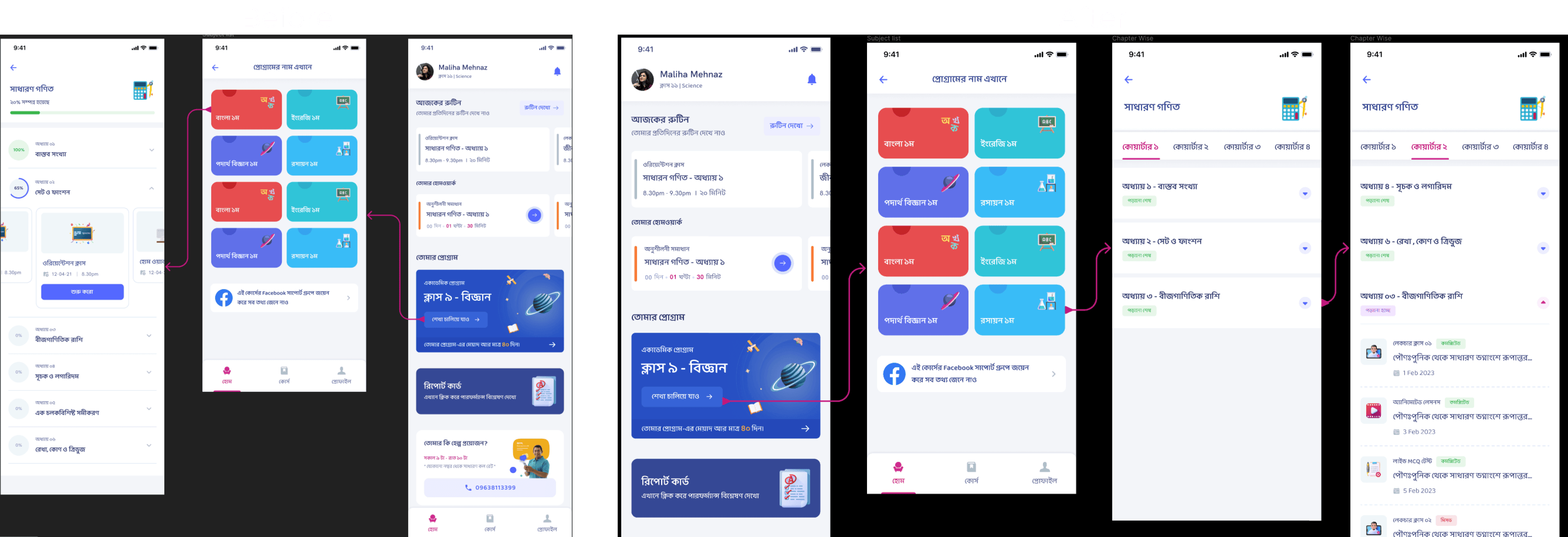
Reworked Shikho's course interface from carousel cards to a list-and-quarter-tab structure so learners could discover lessons faster and navigate large programs with less friction.
Making Course Content Easier to Find: From Carousel Browsing to Structured Discovery
The Shikho Academic Program combines a large amount of paid learning content inside one subscription product. That scale was valuable, but it also created a navigation problem: students could not easily see what was available or where to go next. I led a redesign that replaced a carousel-heavy browsing pattern with a clearer list-based structure and quarter-level navigation, improving content discoverability and making the learning experience feel easier to navigate.
Context
The Academic Program is one of Shikho’s flagship offerings. It bundles premium lessons and study resources into a structured learning product for students preparing for high-stakes academic milestones.
As the program grew, the content organization in the app had to serve two very different needs:
- help first-time learners quickly understand what was included
- help returning learners jump back into the right part of the curriculum without friction
The original interface struggled at both. Important content was buried inside carousels, which made the program look smaller than it actually was. Users had to swipe horizontally to reveal more items, and there was little context about what each lesson contained before tapping in.
The Problem
The problem was not that Shikho lacked content. The problem was that the interface made that content feel invisible.
From a user perspective, several issues surfaced:
- learners could not scan the available content in one glance
- the carousel pattern hid the true depth of the curriculum
- returning users had no fast way to navigate to the right quarter or lesson set
- learners lacked enough context to decide what to open next
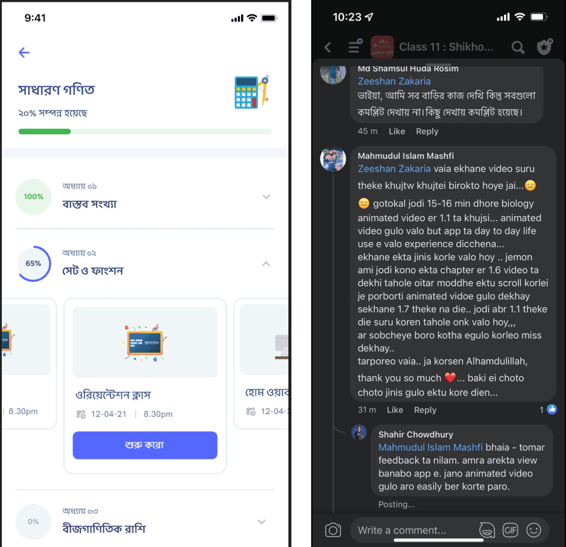
User feedback made the issue hard to ignore. Students were not saying the program lacked value; they were saying it was difficult to see and access that value efficiently.
My Role
I framed the problem as a discoverability issue rather than a pure visual refresh. My role included:
- identifying how the existing browsing pattern was suppressing engagement
- translating user feedback into structural interface changes
- prioritizing which content cues were needed for faster decision-making
- designing a navigation model that worked for both new and repeat learners
The Redesign
I proposed three major changes.
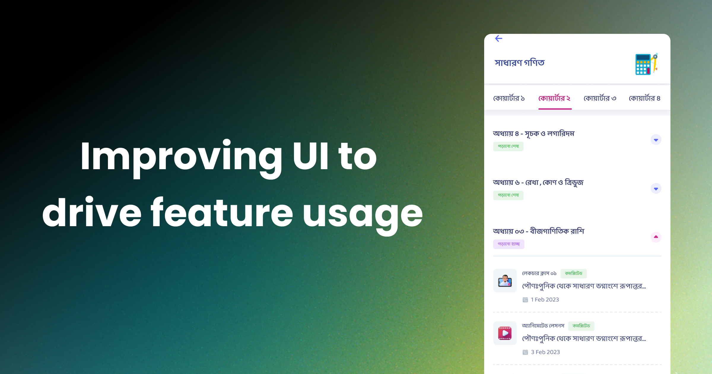
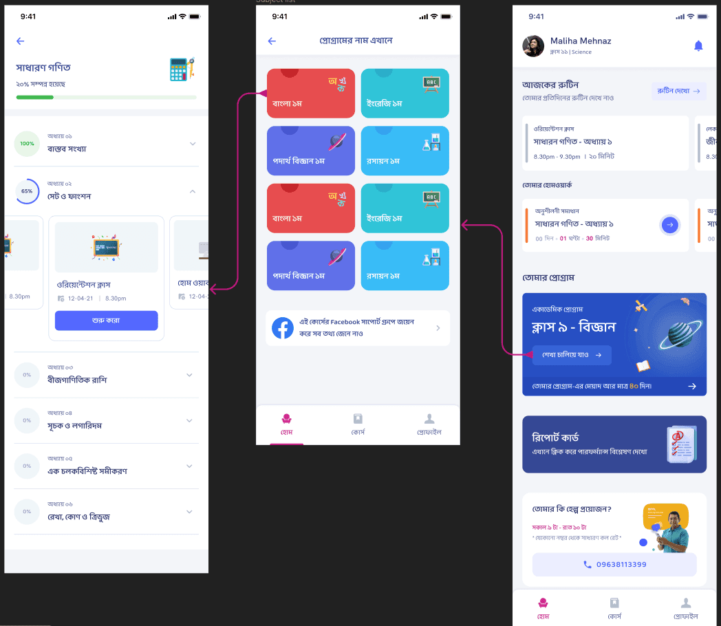
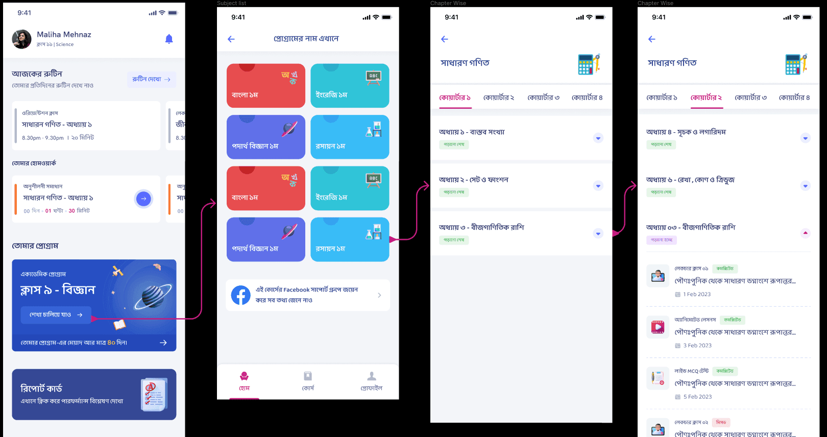
1. Replace carousels with list views
Lists made the content inventory visible immediately. Instead of hiding items behind horizontal swipes, the interface could now communicate scope and structure more clearly at a glance.
2. Add lesson names and clearer information scent
Users needed more than thumbnails. By surfacing lesson names more clearly, the interface helped learners understand what lived inside each chapter before tapping, which reduced guesswork.
3. Introduce quarter tabs
For retained users, finding the right part of the curriculum quickly was critical. Quarter-level tabs created a higher-order organizational layer that made navigation feel faster and more intentional.
Why the New Structure Worked
The redesign improved the product because it matched how learners actually browse educational content:
- they scan before they commit
- they want to see progression
- they need cues that help them re-enter the curriculum
- they benefit when structure is visible instead of implied
The old carousel design optimized for compactness. The new interface optimized for comprehension. That shift matters in learning products because uncertainty slows momentum. If a student cannot tell what is available, they are less likely to start.
Outcome
The redesign improved content discoverability and gave users a clearer path through the Academic Program. The product now presented the curriculum as something understandable and navigable, not hidden behind interaction patterns that favored aesthetics over usability.
This helped in two ways:
- new users could see the breadth of the subscription more clearly
- returning users could locate the right quarter and lessons with less effort
Product Lesson
This project was a reminder that discoverability is not just a UI concern. It directly shapes engagement. When content-heavy products make structure visible, they reduce cognitive load and increase the likelihood that users move from browsing to learning.
For Shikho, the list-and-tab redesign made the Academic Program feel more organized, more complete, and more usable. It turned hidden value into visible value.
More Projects

Ads Pipeline Implementation
End-to-end ads data pipeline and mobile attribution system that unified Facebook Ads, Google Ads, and in-app event tracking into a single BI layer for campaign optimization.

Installment Plan System
Flexible installment-based course purchasing that expanded access to education for students who could not pay upfront.

In-House CRM Transformation
Led the shift from a third-party CRM to a custom in-house sales platform for Shikho's 200-agent telesales team, improving data access, customization, and cost control.