Quick Start Activation Flow
Redesigned Shikho's post-signup home experience to surface lessons and quizzes immediately, reducing early drop-off and improving new-user activation.
Post-Registration Drop-Off: Designing a Quick Start Flow That Helped New Users Activate Faster
Shikho was acquiring new users, but too many of them stalled immediately after registration. I led a redesign of the first-homepage experience so learners could start with a relevant lesson or quiz within seconds instead of navigating through multiple layers of curriculum structure. The result was a simpler activation path that turned registration into actual product usage.
Context
This project started with a classic activation problem: users were signing up successfully, landing on the home screen, and then doing nothing.
That gap mattered. In an education product, the first session is where the habit begins. If a learner cannot quickly find a lesson, answer a quiz, or experience progress, the app becomes easy to abandon. At the time, the post-registration home experience asked users to understand the product structure before they could consume any value. For many new learners, that was too much work too early.
The numbers reflected the friction. Active usage immediately after registration was sitting below 10%, and the pattern was consistent: users would register, browse briefly, and then disappear before completing a meaningful learning action.
The Problem
The issue was not demand. Students wanted to learn. The issue was the sequence of decisions the interface forced them to make before they could begin.
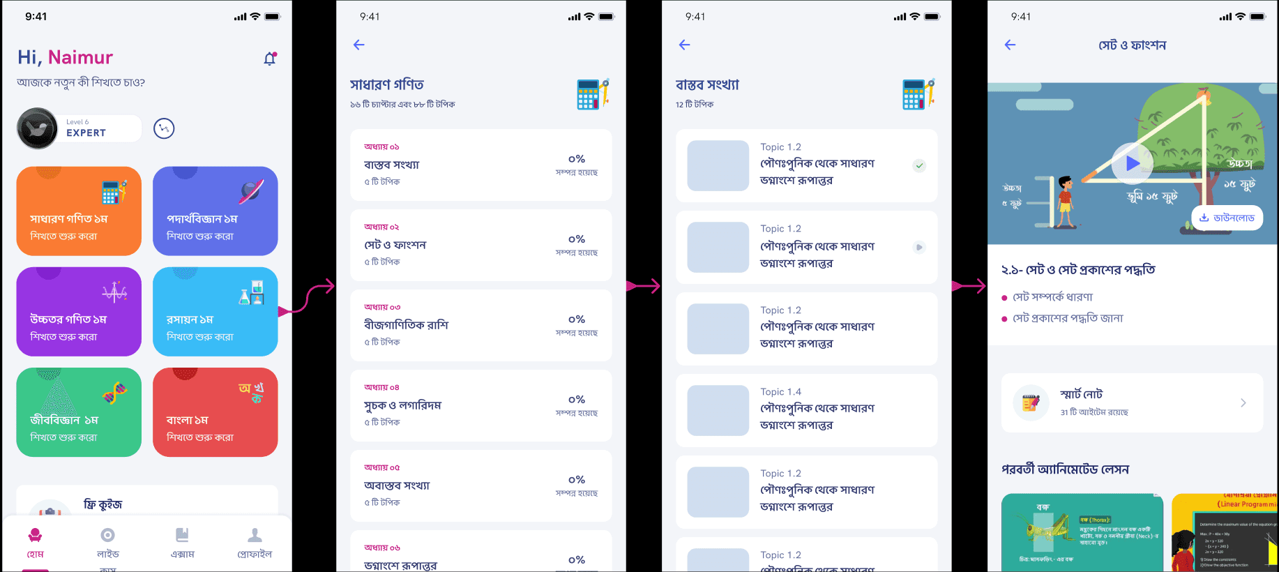
To reach a video, users had to move through subjects, then chapters, then content lists. Each step introduced another opportunity to hesitate, back out, or lose focus. That flow may have made sense from an information architecture perspective, but it was poorly suited to first-session behavior, where users need direction more than optionality.
Two things became clear from the funnel review:
- The homepage was not acting like a starting point. It was acting like a directory.
- The app was making users work to discover content that should have been obvious and immediate.
My Role
I owned the problem framing, solution design, and product direction for the experience. That included:
- analyzing the post-registration funnel and activation drop-off
- defining the first-session product hypothesis
- designing the logic for what content should be surfaced first
- aligning the experience around both learning content and assessment behavior
The core product question was simple: how do we get a newly registered learner to their first meaningful action as fast as possible?
Solution Strategy
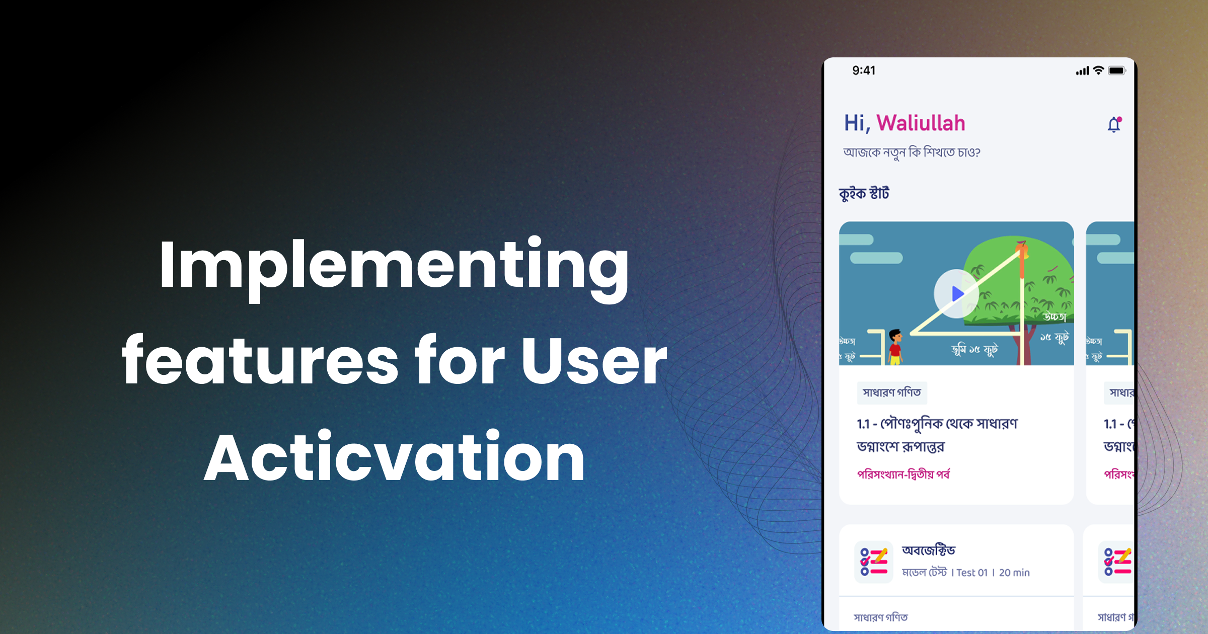
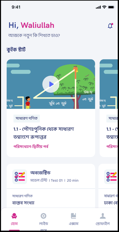
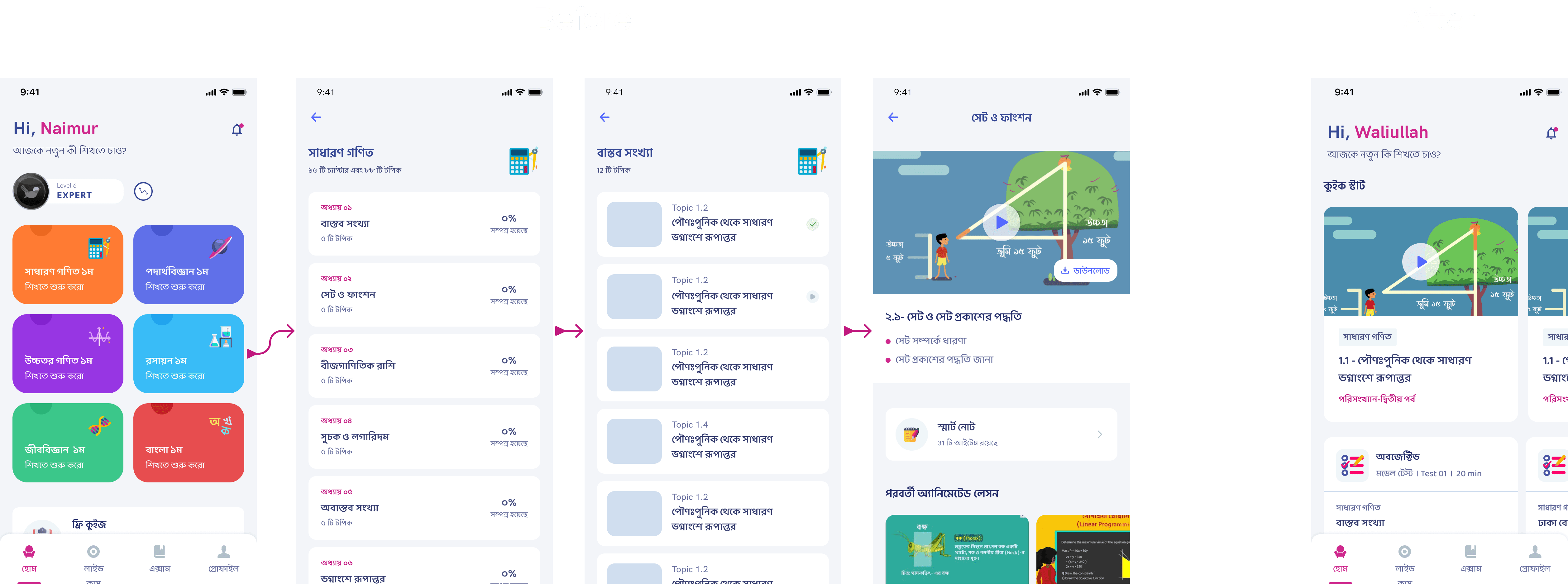
I introduced a Quick Start module on the homepage that brought the next best learning action directly to the user instead of asking the user to search for it.
The redesign focused on three principles:
1. Bring value forward
The first screen needed to present an immediate action, not a navigation system. The Quick Start section surfaced relevant content directly on the homepage so the learner could jump into a lesson without drilling down through multiple screens.
2. Adapt to user state
A new user and a returning user should not see the same prompt. I designed the module so the content shown could change depending on user behavior, helping learners continue where they left off or discover the next logical step.
3. Broaden the definition of activation
Watching a video was not the only valuable behavior. I expanded the Quick Start logic so users could also be pushed toward quizzes and other active learning moments. That made the system more flexible and created more ways for a user to experience early success.
What Changed in the Experience
Before the redesign, the product expected users to understand the curriculum structure first and only then consume content.
After the redesign:
- the homepage surfaced a clear starting point
- content was presented in a more action-oriented way
- users were guided toward the next meaningful step instead of being left to browse
- quizzes became part of the early activation path instead of a later-stage action
This changed the role of the home screen from passive navigation hub to active learning launcher.
Why This Worked
The Quick Start pattern worked because it matched the mental state of a new learner. Right after signup, users are not asking, “What is the full structure of this product?” They are asking, “What should I do first?”
By answering that question directly, the redesign reduced cognitive load at the exact moment it was hurting activation. It also created a better balance between user autonomy and product guidance: learners still had access to the broader curriculum, but they no longer needed to decode the app before finding value.
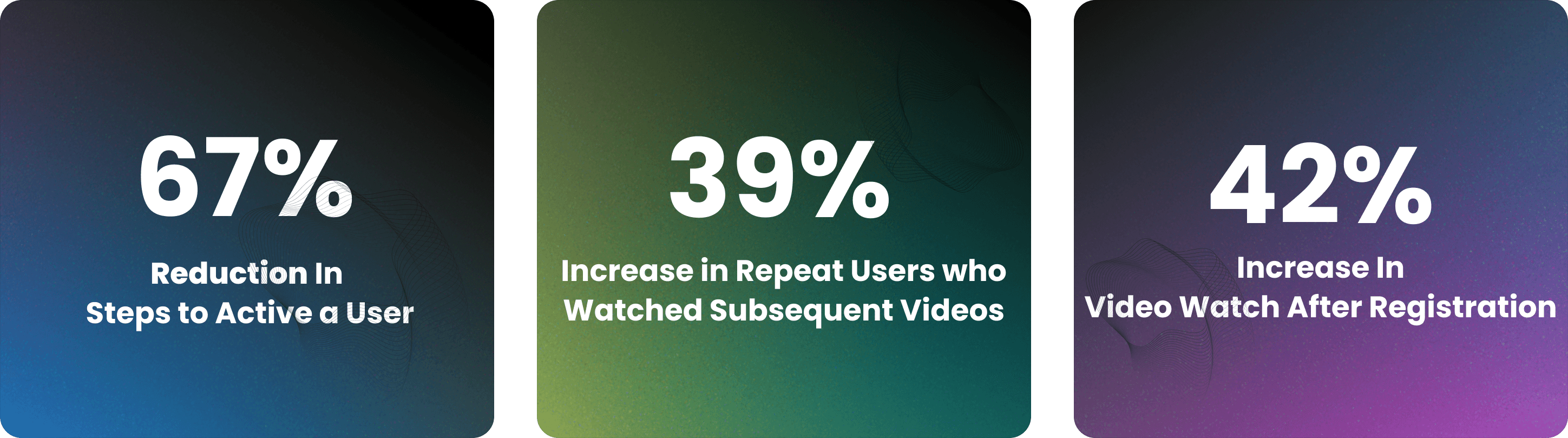
Outcome
The new flow improved early activation by getting more users to interact with content directly after registration. More importantly, it addressed a behavior pattern that was hurting long-term retention: users leaving before completing even a single meaningful activity.
This project reinforced a product lesson I still use often: if users are dropping off early, the answer is not always more onboarding. Sometimes the right move is to remove decisions and put the value directly in front of them.
More Projects

Ads Pipeline Implementation
End-to-end ads data pipeline and mobile attribution system that unified Facebook Ads, Google Ads, and in-app event tracking into a single BI layer for campaign optimization.

Installment Plan System
Flexible installment-based course purchasing that expanded access to education for students who could not pay upfront.

In-House CRM Transformation
Led the shift from a third-party CRM to a custom in-house sales platform for Shikho's 200-agent telesales team, improving data access, customization, and cost control.